Building a brand that inspires community through a skateboarding
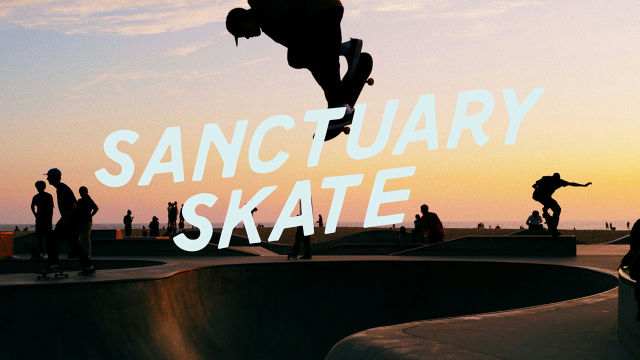
Sanctuary Skate needed more than a logo. It needed an identity capable of growing into a recognizable movement. The visual identity needed to resonate with young skateboarders while also feeling trustworthy to parents, volunteers, and potential sponsors. The challenge became designing a brand system that could balance two seemingly opposite ideas: authentic skate culture and organized community programming. The result needed to feel energetic without becoming chaotic, expressive without looking amateur, and memorable enough to unify every touchpoint of the experience.
The visual identity was built around four primary goals: Create a recognizable brand that feels at home in skate culture. Design a flexible system that scales from social media to large-format environmental graphics.
Build consistency across execution verticals by developing a visual language that encourages participation while remaining sponsor-friendly.
An identity that lives between adventure and asphalt.
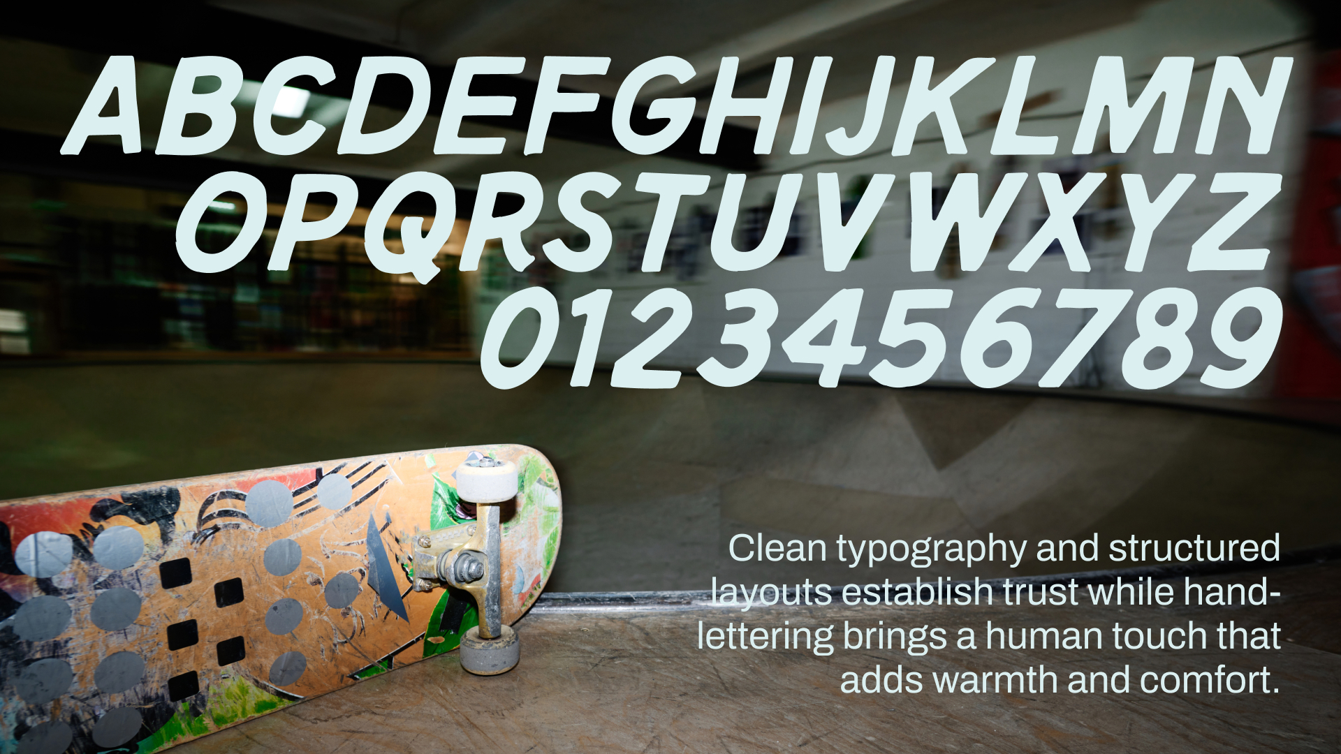
The hand-lettered style "Ollie" logo roots the brand in authentic skate culture while evolving through motion across apparel, skate hardware, events, and digitally. A bold, high-contrast color palette creates instant recognition in energetic environments while remaining flexible for campaigns and sponsor integrations. Expressive photography balances adventure with urban grit, celebrating the authenticity, community, and warmth that have always been at the heart of skateboarding without softening its edge.
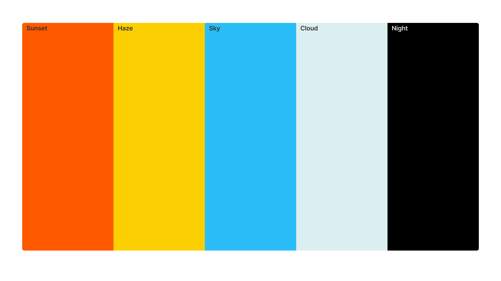

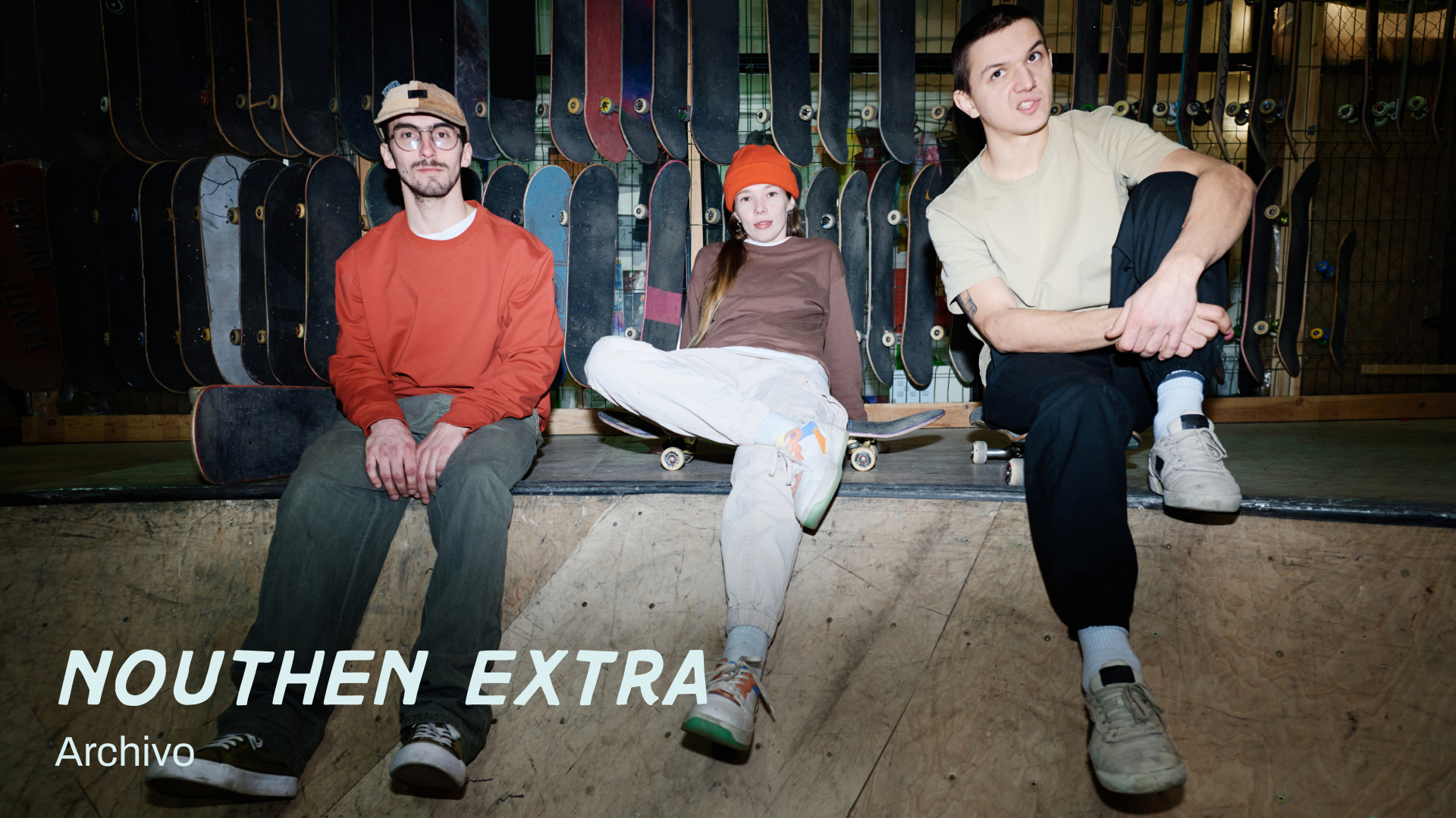
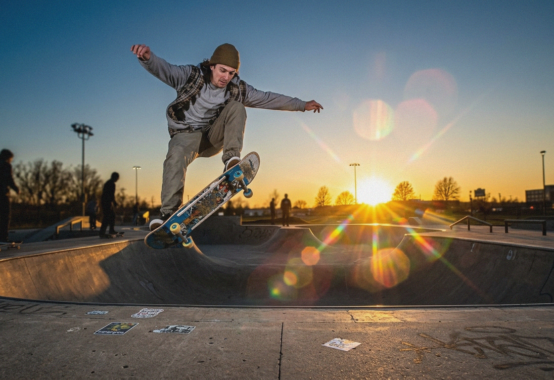
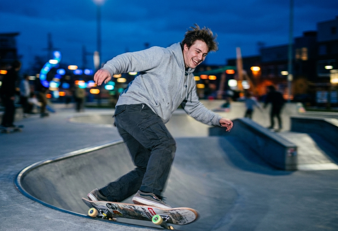
Gemini prototyped early visual concepts rather than final designs. By training the model on curated images, focusing on movement, lighting, and color, we rapidly tested different atmospheres to establish a cohesive visual identity.


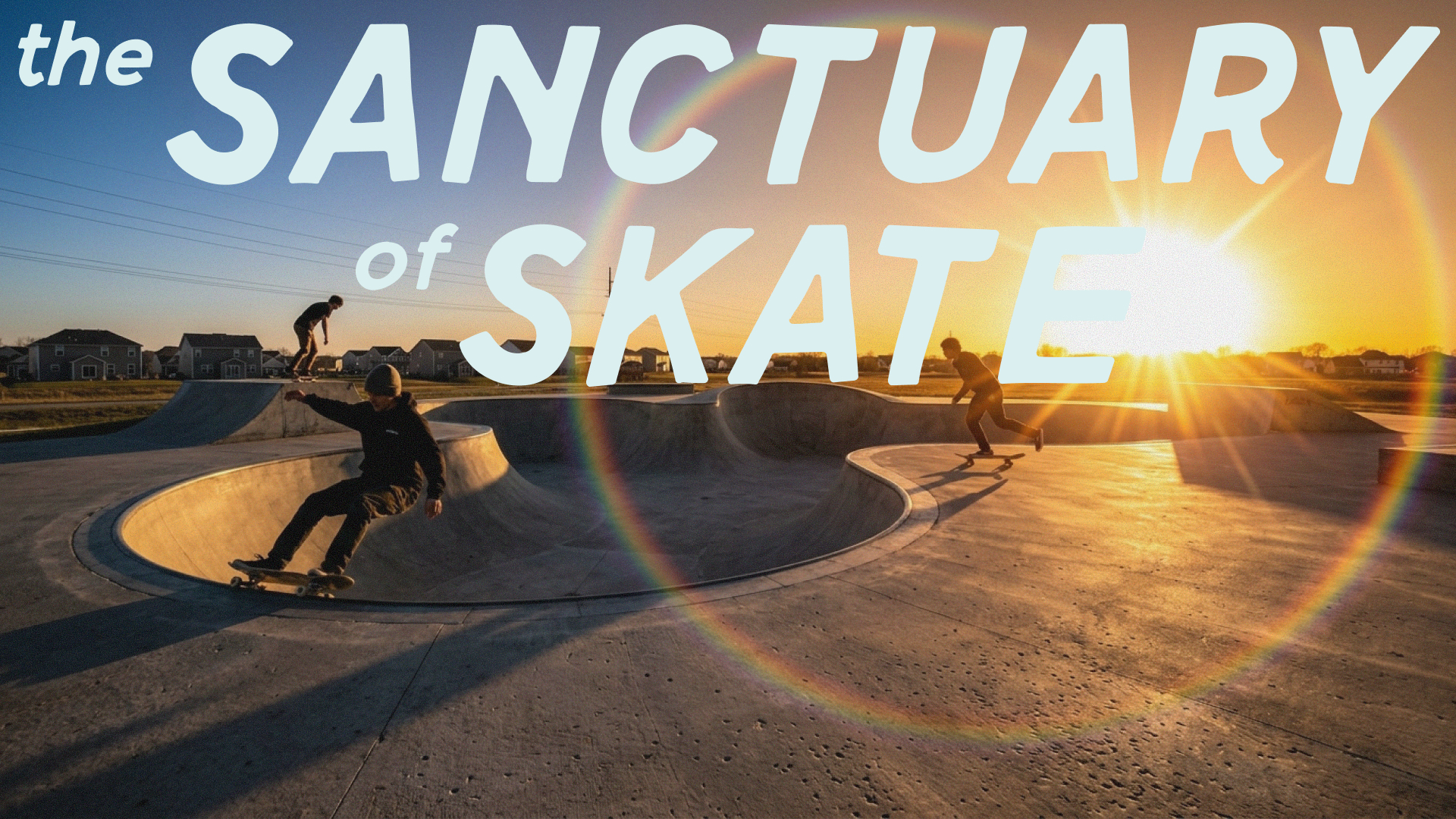
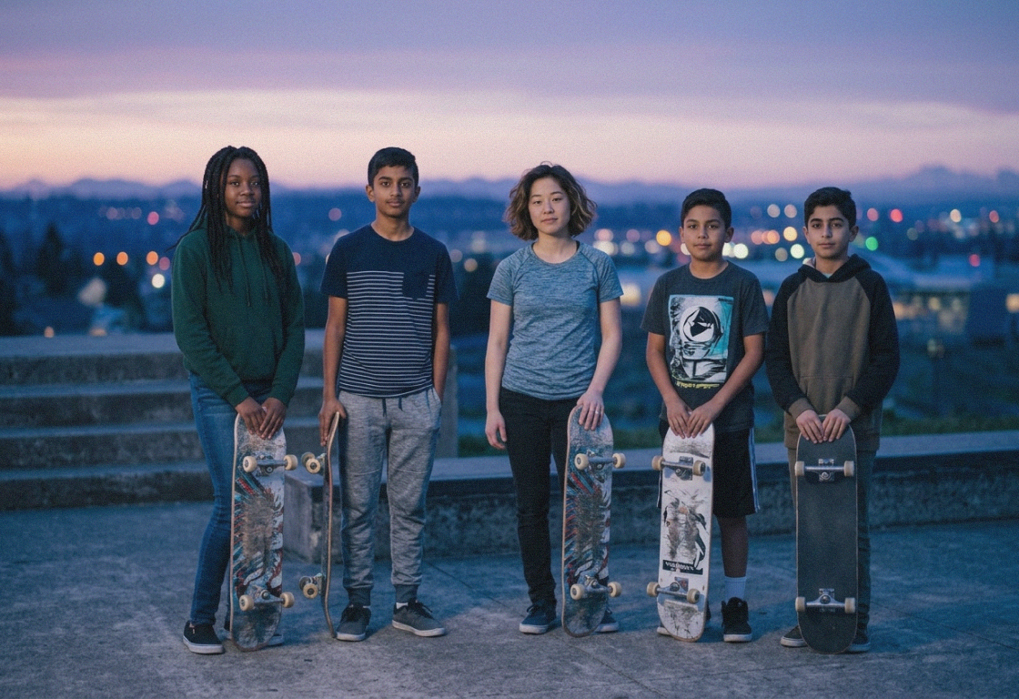
Each event transforms familiar skate parks into recognizable Sanctuary spaces with a takeover system of graphics in the surrounding area including flags, large-format posters, print material, wayfinding, welcome kits, and apparel.
It borrows the optimism of summer camps, the permanence of national park systems, and the expressive energy of skate culture to create a brand that feels familiar. Instead of focusing solely on tricks and professional athletes, the imagery highlights mentorship, friendships, progression, and shared experiences.
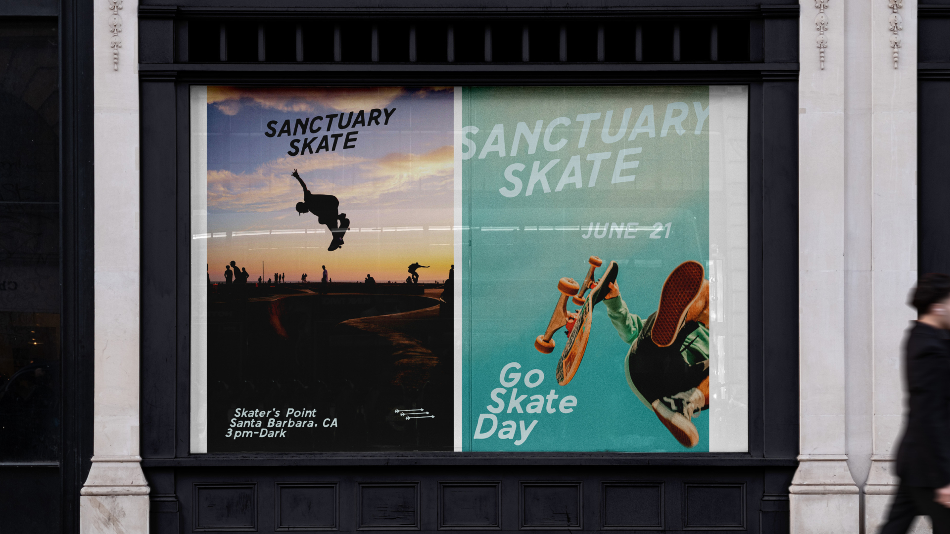
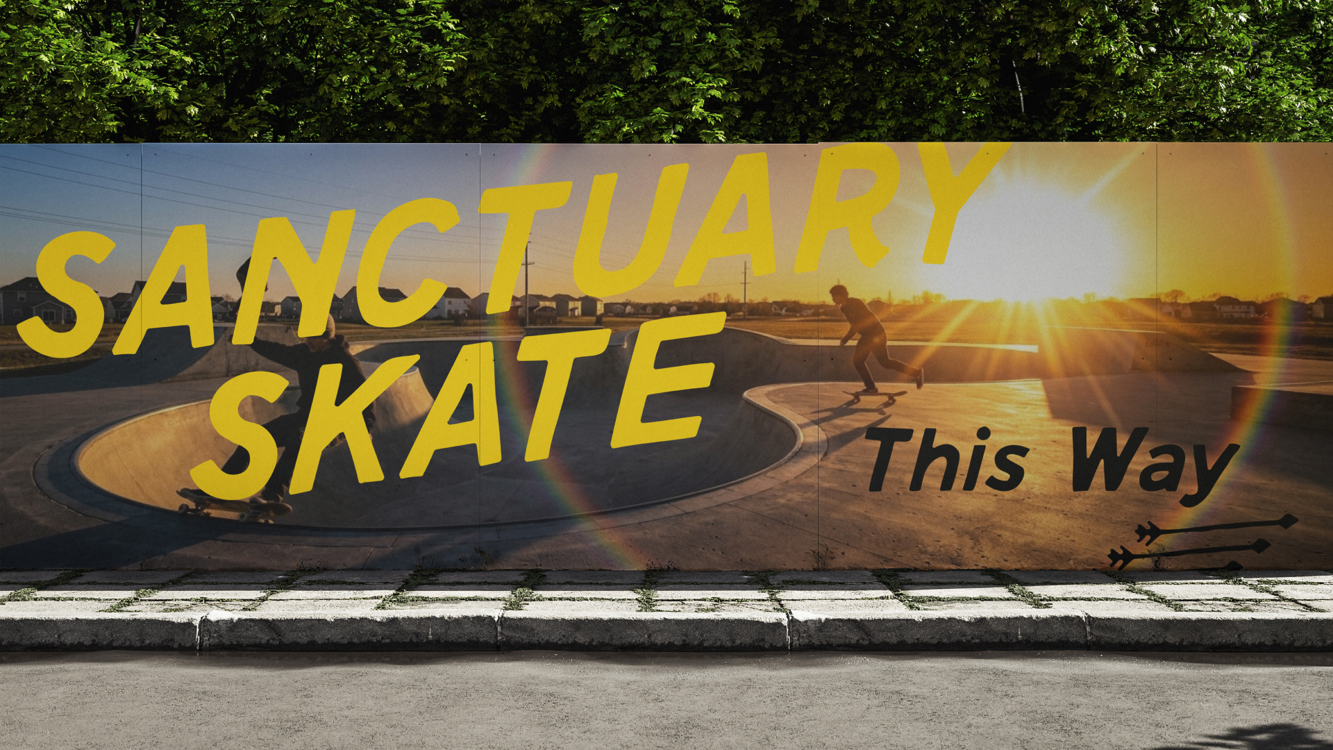
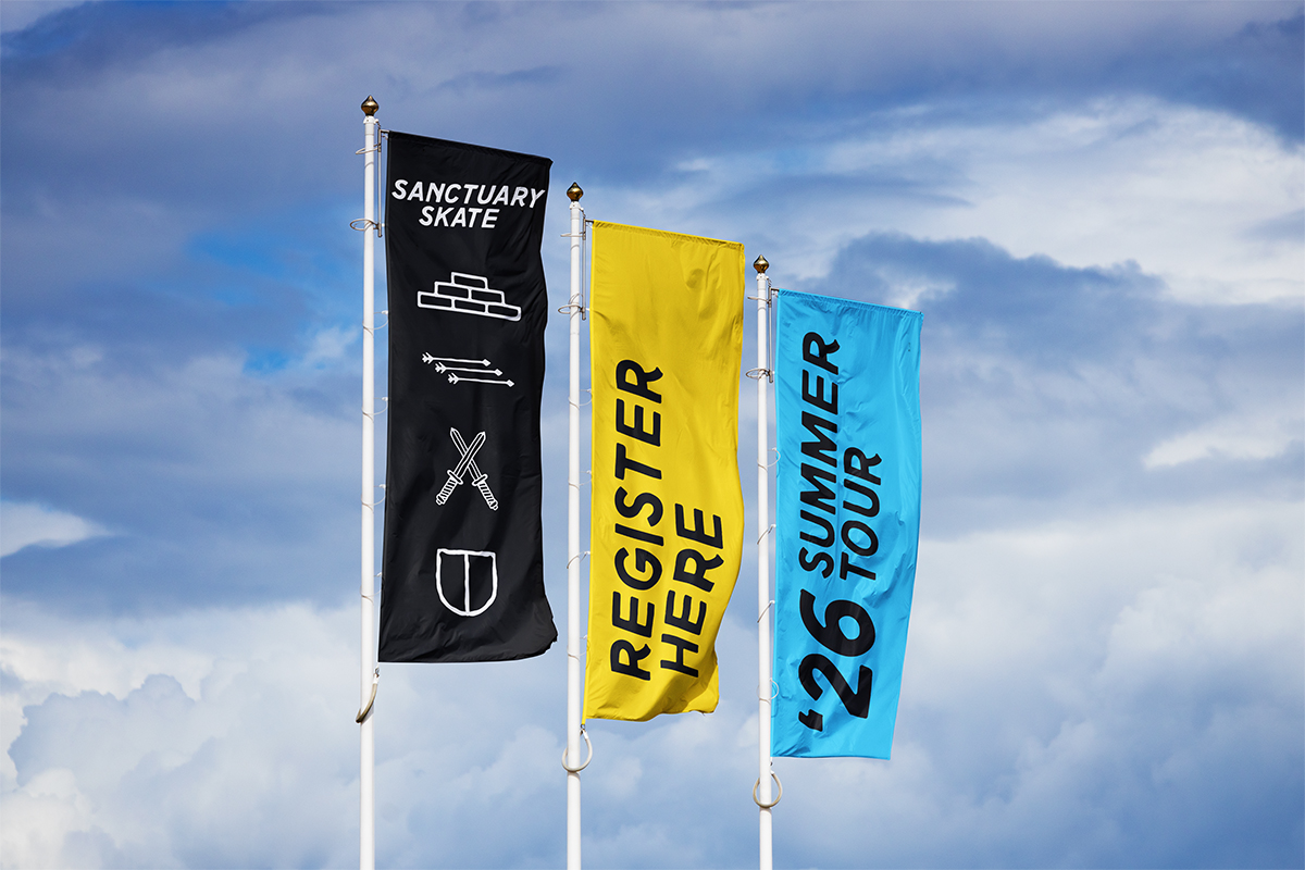
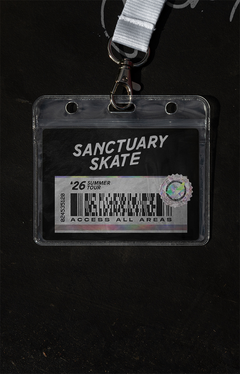
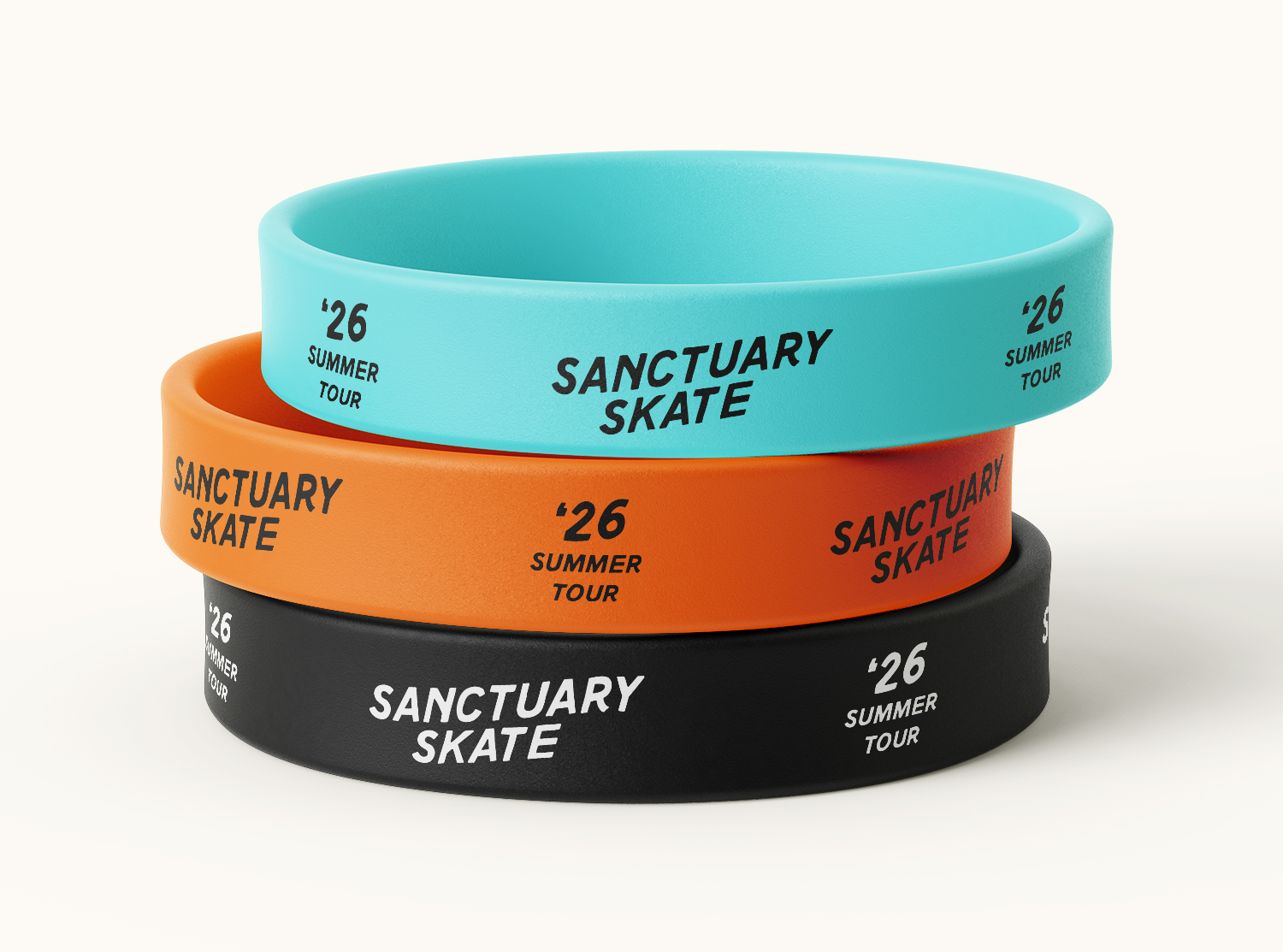
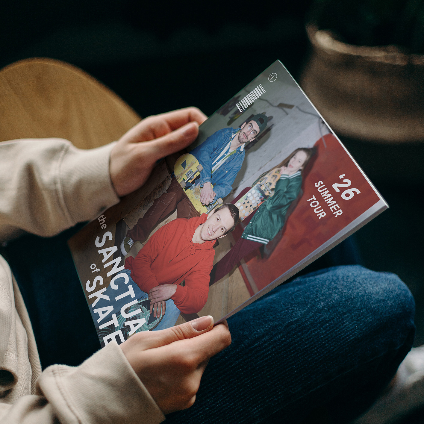
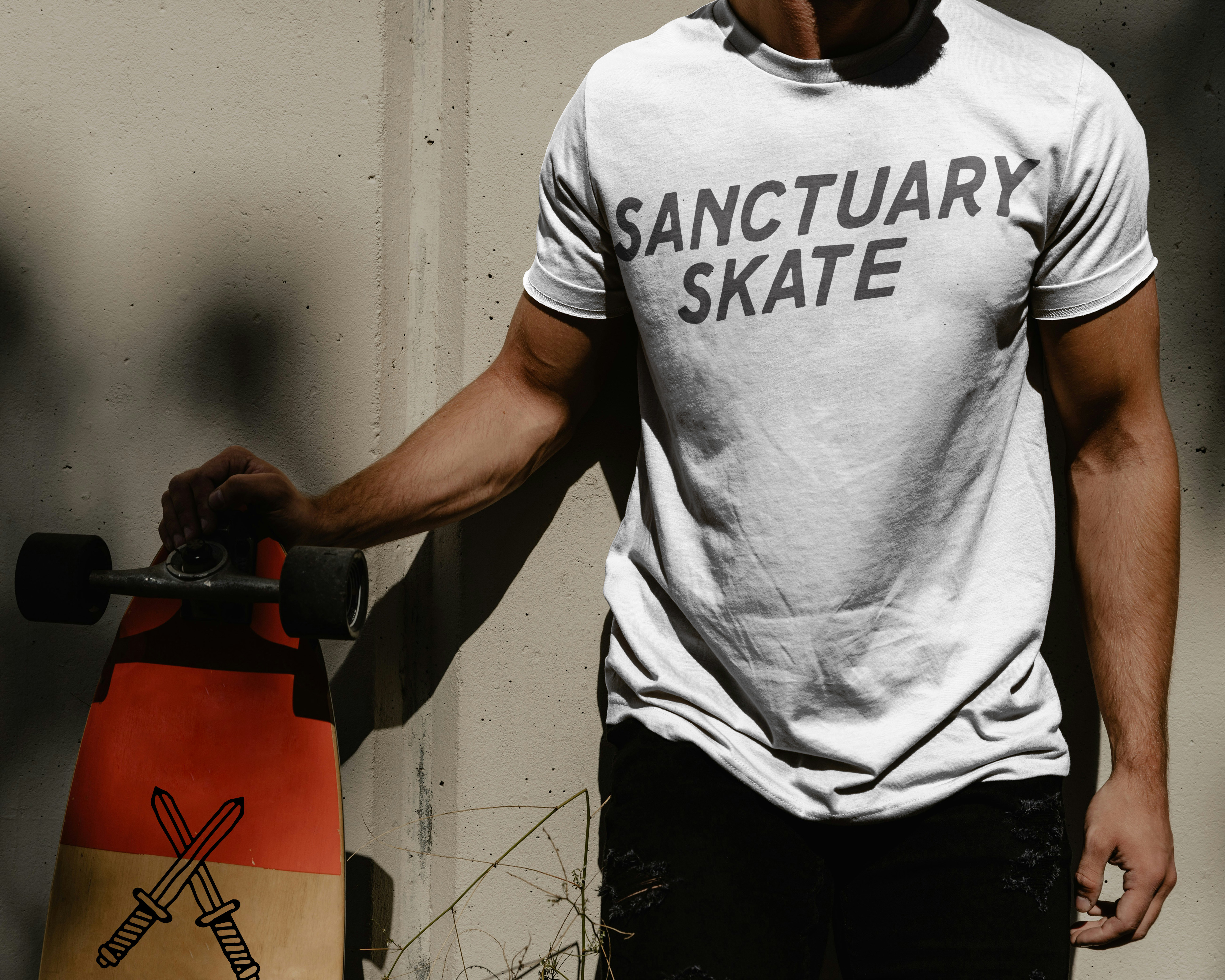
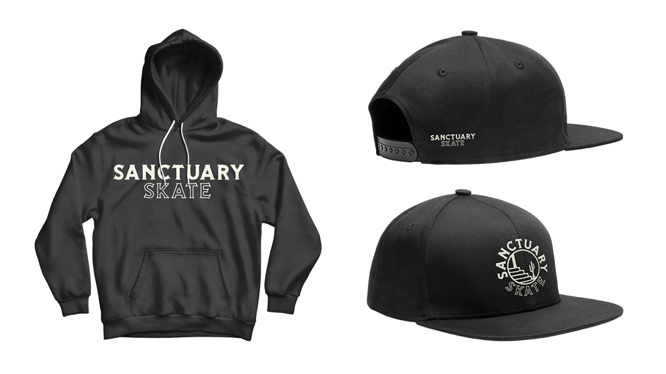
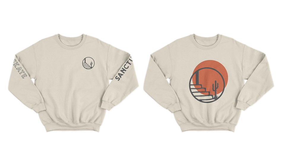
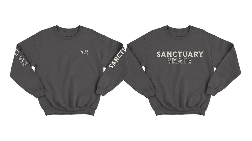
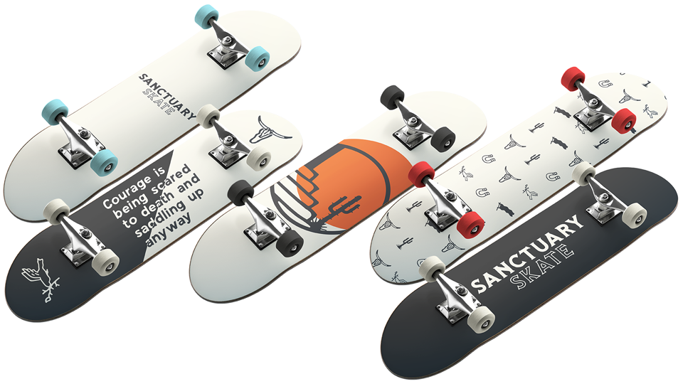
The final identity transforms Sanctuary Skate from a local event into a recognizable brand experience. Rather than simply creating attractive graphics, the project established a flexible design language capable of supporting future growth across physical events, digital marketing, merchandise, sponsorships, and community engagement.
Every element, from typography and color to photography and motion, works together to create a cohesive experience that feels authentic to skateboarding while remaining accessible to families, volunteers, and partners.